A Peek at the Perks of Price My Funeral
Just days ago DISRUPT Media introduced Price My Funeral, a brilliant new lead generation tool built exclusively for the funeral home profession. DISRUPT owner and CEO Ryan Thogmartin created Price My Funeral to offer death care professionals the social traction tools that were missing from the market’s current lead gen options.
“Everything within Price My Funeral is based on social intent,” says Thogmartin,. “Price My Funeral captures robust data that can be easily leveraged to retarget consumers across social media channels and elsewhere online.”
Will Price My Funeral DISRUPT the future of funeral home marketing (pun intended)? There are a couple of reasons we believe it’s actually the next generation of lead generation in the profession (OK, I’ll stop).
We know your schedule is anything but predictable — in fact, that understanding was the basis of several elements of the Price My Funeral platform. Therefore, maybe you haven’t yet had time to contact DISRUPT Media for a personal demo. If so, here’s an inside look at a few of the features that make Price My Funeral truly unique, hassle-free, and hands-down the best solution for driving high-quality leads directly to your business.
Personalization
From the very first page of Price My Funeral, your potential customers will know they’re in the right place. This page is completely customizable, from your funeral home logo to the text you’d like to convey to your visitors.
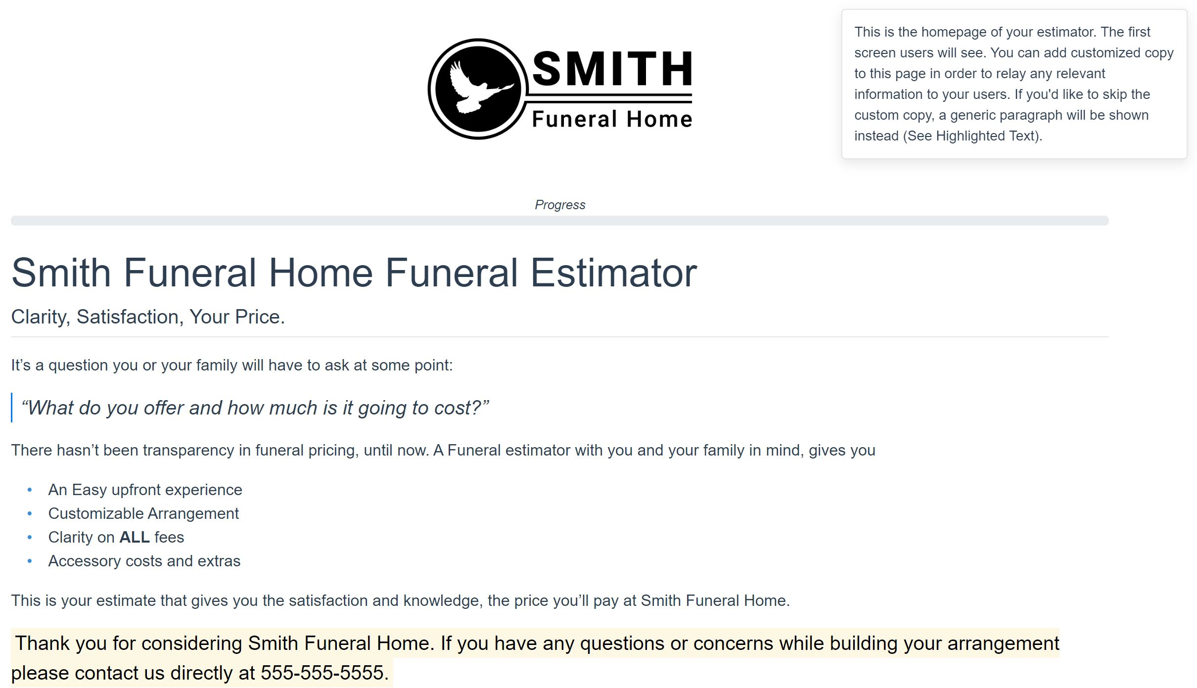
If you opt out of custom content, Price My Funeral will include a default paragraph with your contact information.
“Continue Where You Left Off”
On the first page of Price My Funeral your visitors will see “Continue Where You Left Off” and “Start Over” buttons.

One of the most frustrating online experiences for today’s consumer is having to retype something they’ve already entered. We’ve come to expect sites to capture our data, and if they don’t, we’ll find another option that is easier to use.
With Price My Funeral, users can exit the tool at anytime during their selection process. The next time they visit the site, returning users have the option of picking up on the page where they left off. All of the data they’ve entered will be there exactly as they left it.
While this is an excellent user experience, it’s also a great feature for you. You have access to this data in your Price My Funeral dashboard, so you’ll know exactly how many people have started an estimate, where they exited, and what they’ve entered so far.
Best of all, you’ll have enough information about them to retarget them on social media and in online ads. In this way you can retarget them with products and services they’ve already shown an interest in. You can also nudge them to come back and complete the process.
Progress Bar and Separate Burial and Cremation Paths
On the second page of Price My Funeral, your visitors will have the option of following either a burial or cremation path. This way they’re not forced to wade through your entire selection of products and services when some may not apply.
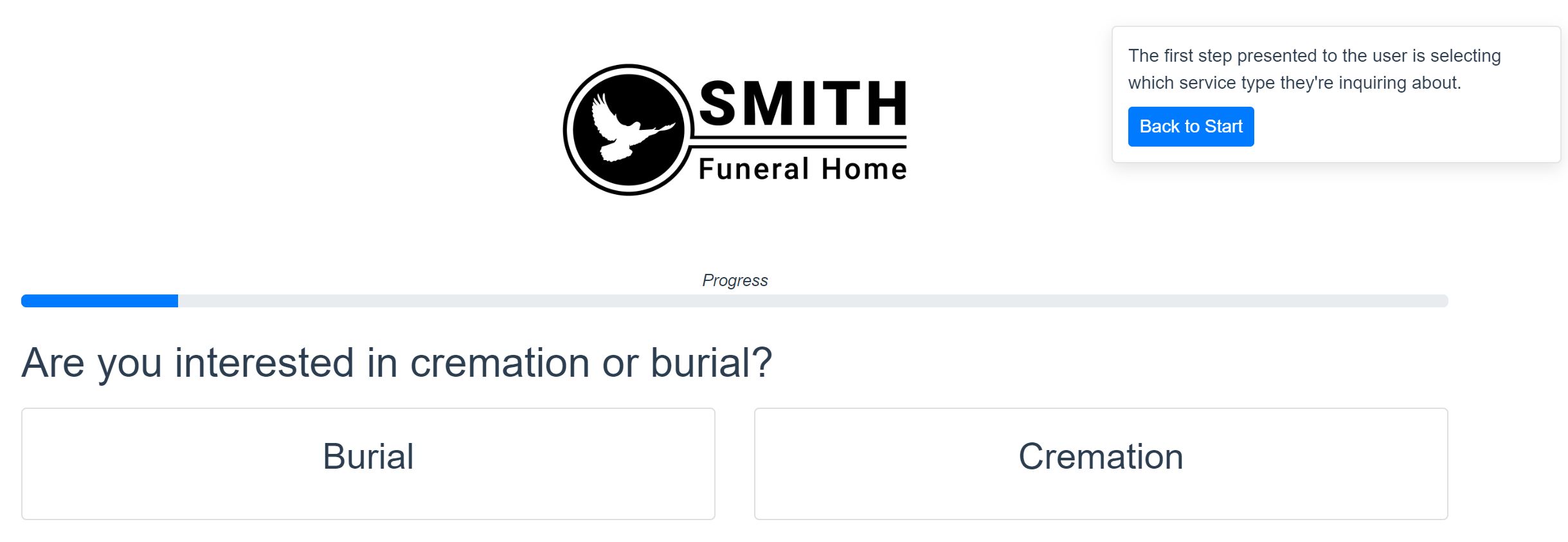
Additionally, the progress bar below your logo shows the user how far they have to go in their session. For most visitors, a Price My Funeral estimation takes about 9 minutes.
Pricing Transparency
Once the visitor selects burial or cremation, they’ll see your service options. Transparency is a huge element of Price My Funeral. Not only are you proactively going above and beyond the Funeral Rule’s requirements. You’re also educating users on exactly what goes into each package of services you offer.
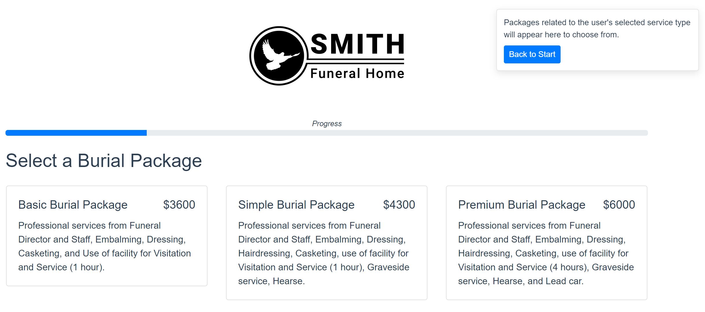
All of your products and services pages within Price My Funeral are customizable easy to set up. The DISRUPT team will also be available to help you through your initial input and platform updates.
Container Images and Descriptions
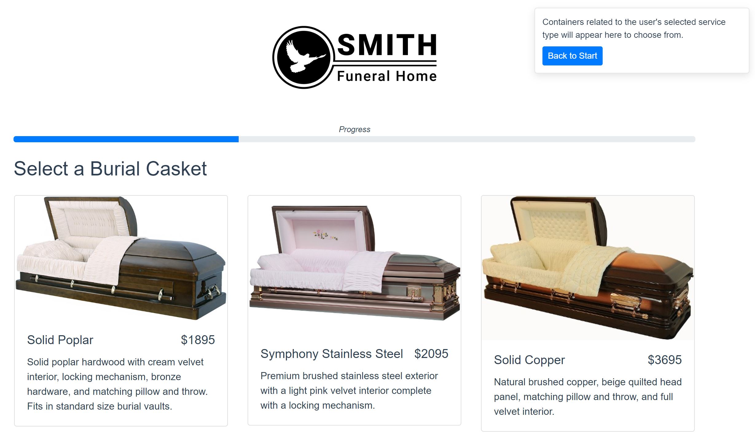
Depending on the user’s selection of burial or cremation services, they’ll next see images, pricing, and descriptions of appropriate containers. Again, your team can customize these options using your product catalog images and default details, or write your own text. The following page, featuring your outer container options, works the same way.
Cash Advance Selections
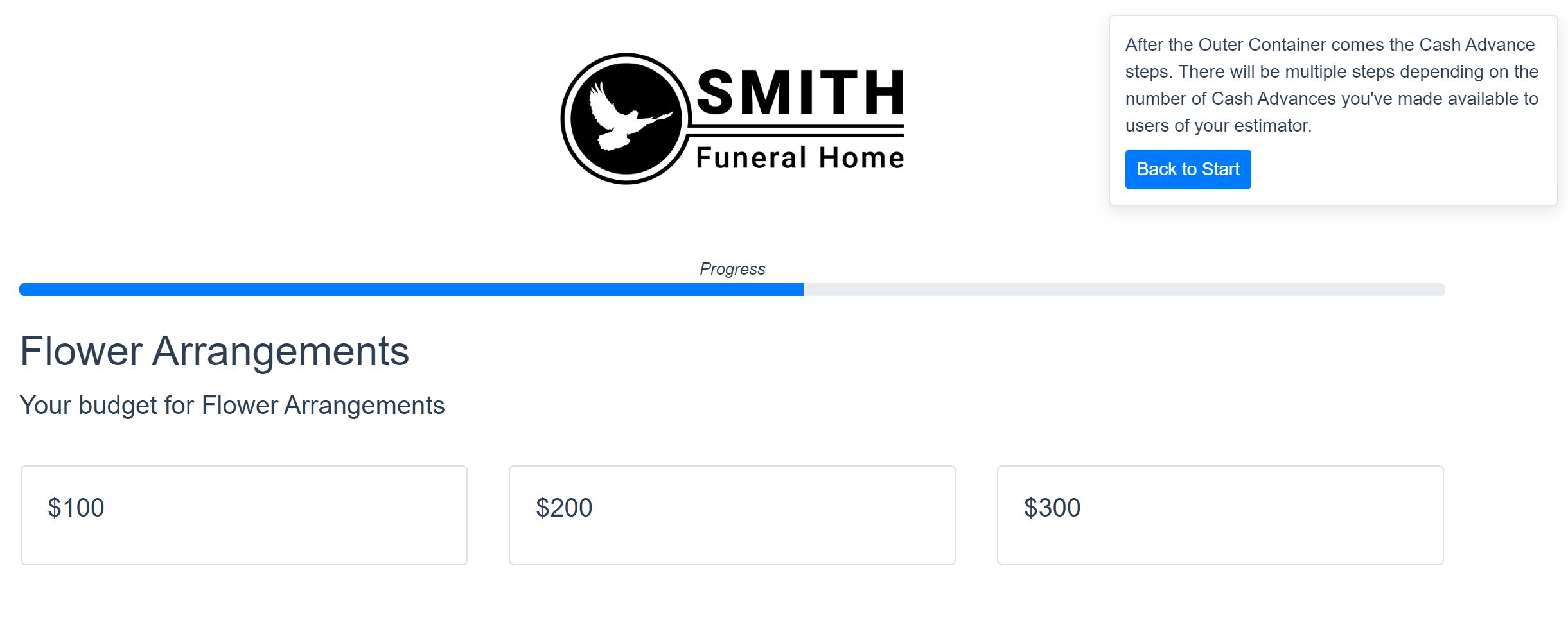
Your next series of pages are cash advance options like flower arrangements, obituary notices, motorcyle escorts, register books, or whatever you want to make available to your visitors.
Lead Generation Page
This is where some of the real magic happens! You’ll ask your estimator user to provide their name and phone number. Both fields will be required to review the total estimate of their selections. They also have the option to have a copy of their arrangements emailed to them.
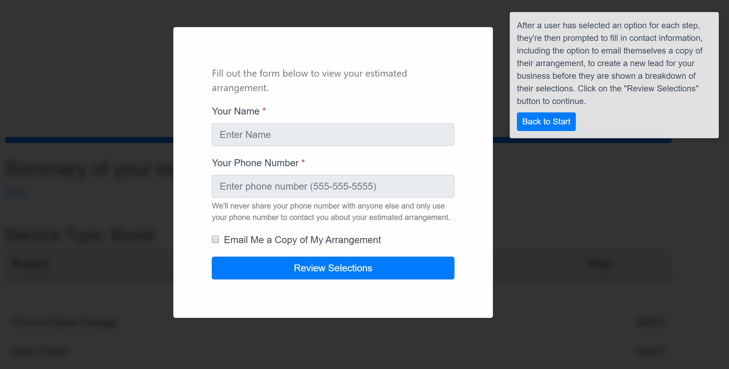
Remember, though — even if someone gets to this page and opts out of providing their name and phone number, you still have enough information to retarget them with user-specific ads based on the behind-the-scenes data Price My Funeral has gathered throughout the selection process.
Ta-Da! The Price of a Funeral
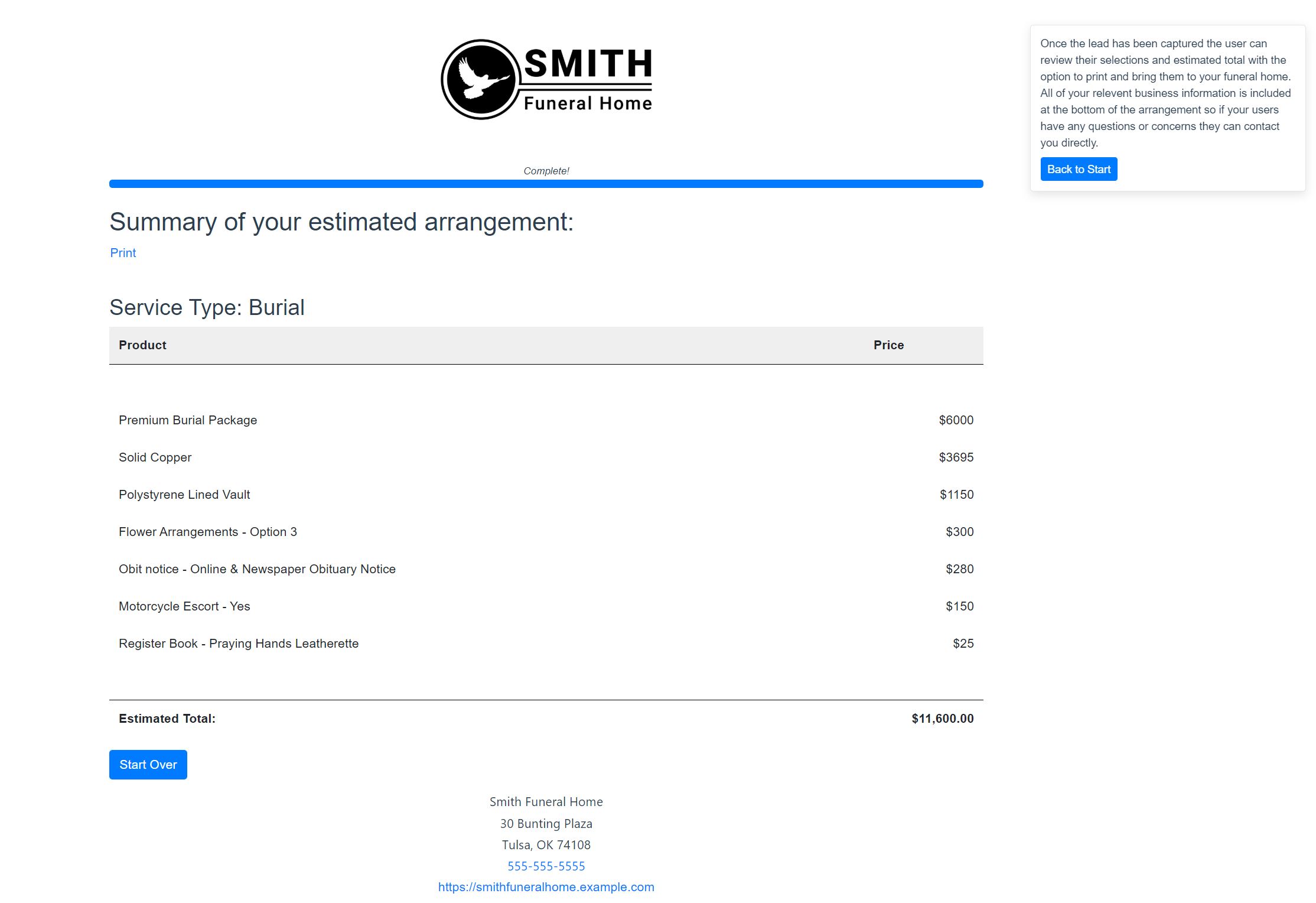
The final page of Price My Funeral is a list of the products and services the user has selected for their arrangement. It’s printable, so it’s easy for them to keep a copy for family members for planning purposes or bring to you for a preneed. And of course, all of your contact information is conveniently located at the bottom of the page in case the user wants to get in touch with questions or make an in-person appointment.
Screenshots don’t do Price My Funeral justice, though. For a full demo of the tool, visit PriceMyFuneral.com and register.

