8 Funeral Home Websites Breaking the Cookie-Cutter Mold
Article By: Curtis Funk, Tukio
As we all know, the public has a very mixed view of funeral homes. With most people today doing their due-diligence online, the last thing you need is for your website to give off the message of being dirty, dark, stinky, unorganized, or out-dated. Instead you want them to feel you are very clean, fresh and organized. I have seen thousands of funeral home websites and here are a few from different providers and in different parts of the world that are doing things very well.
1. Horan & McConaty // Denver, CO
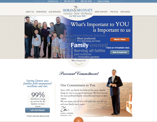
When you arrive at Horan & McConaty’s website the color scheme invites you to stay for a while. Their site was designed by the very experienced team at FuneralNet.
What I like about it.
The most prominent call-to-action is the “Watch Video” button. This button drives you to a beautifully designed page with stories from families they have served. Each story is told with a video!
The colors are clean but not too bright. There is a lot of useful content, but the site doesn’t seem too busy. It’s very organized with just enough blank space.
2. Metcalf Mortuary // St. George, UT
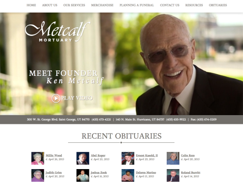
My first thought when I came across this site was – “What? Batesville??“ Knowing that most Batesville sites can be spotted from a mile away, I was quite surprised to find this one. Kudos to the Batesville team for stepping up their game.
What I like about it.
The site is clean and welcoming. Introducing Mr. Metcalf right in the main image gives a personal touch to the homepage, and the video about him is very powerful.
Recent obituaries are front and center, where they should be.
http://www.metcalfmortuary.com/
3. Woolertons’ Funeral Home // Hamilton, New Zealand
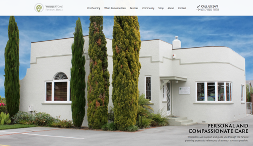
This site is from a funeral home down in New Zealand. It has a clean design and from what I can tell wasn’t developed by any funeral-specific website provider.
What I like about it.
This site immediately establishes the brand by attaching it to the funeral home facilities. It leaves no room for the user to wonder whether or not this is the funeral home they were looking for. The building isn’t breath-taking, but the photo is beautiful.
http://hamiltonfuneralhome.co.nz/
4. Legacy Funeral Center // Jeffersonville, IN
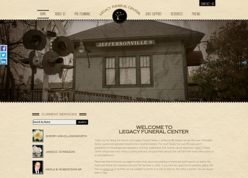
This is another site from an industry provider that you wouldn’t guess. FuneralTech has quite the spectrum of designs where it takes some navigating to find out who made the site.
What I like about it.
First of all, it doesn’t feel cookie-cutter. When I first saw this site I thought, “It looks like these guys hired a web-designer.” Meaning a “non-funeral specific” web design firm, but then after making my way through the site I learned it was FuneralTech. Their websites have excellent integrations with their arrangement software and funeral planner app.
http://legacy.legacyindiana.com/
5. Fred Hunter’s // Hollywood, FL
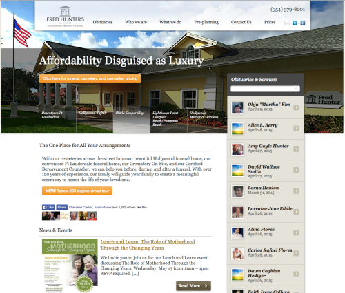
This site has me wandering over to Travelocity to book a flight to somewhere tropical. The engagement-oriented team at Funeral Innovations put this one together.
What I like about it.
I love that they’re not afraid to tackle the price question. Their main call-to-action is to see what it costs to have a funeral. I also love that the obituaries are on the front page and the whole site is loaded with ways to engage with the community.
6. Donaldson Funeral Homes // Laurel, MD
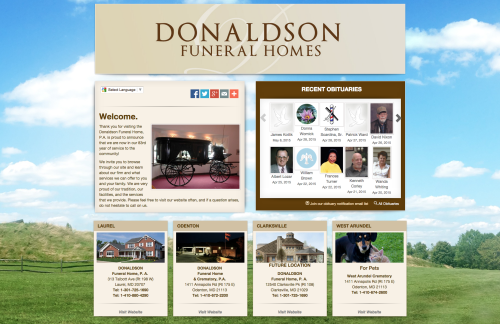
This site was built on the Consolidated Funeral Service platform. It has a nice “sweet & salty” feel with the contrast of the bright and neutral colors.
What I like about it.
The CFS platform gives the funeral home complete control over design. They can change the backgrounds, layout, foreground elements, and design and place any section anywhere they would like it. The most crucial elements on the site are front and center.
Another excellent bonus is the cost, that is… no cost.
http://www.donaldsonfuneralhome.com/
7. Keohane Funeral Home // Quincy, MA
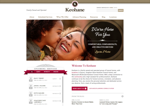
This site was not designed by an industry website provider, but the layout, the colors, and the functionality are very nice. It isn’t mobile-responsive so Google will be docking them points until that is remedied.
What I like about it.
I haven’t been in any of their funeral homes, but my sense from the website is that they are very clean. The obituaries are right in front of you, as they should be. They used very elegant fonts and it’s obvious that this isn’t a cookie-cutter design.
Without being designed by an industry provider, I expected their obituaries to look just like all the other blog-post type obits. To my surprise, their obituaries look very nice.
8. Lady Anne Funerals // Sydney, Australia
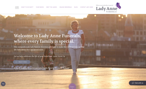
This website is far from a cookie-cutter look! Not only is the website different, but the business is unconventional in an industry predominately occupied by men.
What I like about it.
I feel like I already know Lady Anne! She is right there on the home page. The video is one of the main calls-to-action and it acquaints you with her even more.
People love to do business with people, and this website introduces you to a real person. Not to mention the design and colors are clean and beautiful!
http://ladyannefunerals.com.au/
What funeral home websites have you seen that don’t look like all of the rest?